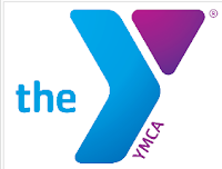
Everyone knows the YMCA. When someone says this acronym there’s generally no question as to what they’re talking about. Some people may not know that it stands for Young Men’s Christian Association or that it’s one of the oldest and most important non-profit organizations, but just about every person has a familiarity with the letters YMCA.
This is exactly what the YMCA found troubling- every person was familiar with the letters YMCA but a lot of people had no idea what the organization actually did or the values they stood for today. The YMCA realized that there was no clarity or cohesiveness in their logo, brand, or message throughout their thousands of YMCAs across the country and invested time and money into the most extensive research the organization has ever conducted.
With their findings, the YMCA has just rolled out a new nickname and a new style with a clearer message:
- The YMCA will begin being known officially as “The Y.” They will of course be keeping the full YMCA acronym in their brand, but they will be emphasizing their identity as "The Y" because that is how they are known in the community.
- Rather than letting every Y branch pick their own style of Y logo (this has been the case for about 50 years and there are thousands out there), there is now only one usable Y logo that comes in 5 colors. The new logo is a more modern, sleek, and vibrant variation on their traditional Y logo
- The Y has had dozens of mottos, slogans, and missions between branches, and they have now replaced their old “We build strong kids, strong families, and strong communities.” The new slogan is: “For Youth Development, For Healthy Living, For Social Responsibility.”
This rebranding campaign was launched ten days ago and all of their websites have already fully incorporated the new logo, as well as making the new logo launch a big part of their Wikipedia page. Although this seems very abrupt, the full integration of this brand revitalization is scheduled to be very gradual with the entire new look and message completely incorporated by 2015.
I did gymnastics at the Y for 13 years, worked at the Y since I was 16 and even spent four years on the San Diego YMCA Board of Directors, so I am no stranger to the organization or its message. I had been hearing whispers of a rebrand for about a year now and I was delighted when they finally unveiled the new logo and ideas at our staff meeting last week (I was the only one taking diligent notes on the presentation).
I am extremely impressed with the direction they're going- I think so many people have really inaccurate and dated perceptions of the YMCA and it's really important for the Y to finally address this. The YMCA has always had strong brand recognition because they are so prominent and well-known but it's really great to see them start to be in control of their brand and pay more attention to the message of their organization. I think a 5-year window is a very realistic goal to get this rebrand in full swing and it's smart to do it at a slow pace so that people aren't thrown off by it or start thinking their "favorite YMCA is trying to get all hip" on them (that's actually what I was told by one of my level three gymnast's grandmothers).
This is a really great move for the YMCA and they are yet again setting the bar for other non-profits to follow. But that is one thing I find so interesting and incredible- even non-profits are now finding it necessary to pay close attention to their public image, perceptions, and brand! Non-profits do wonderful things and amazing work but even that is not enough anymore; companies who do tremendous good are finding it necessary to take a more hands-on and active approach to how they are perceived by the public. I think that just proves how powerful good advertising and PR are for every company and it's amazing to see one of the country's oldest and most influential non-profit organization jumping on board with that.


"the" new logo doesn't make any sense.
ReplyDelete